Hannah Eng Photo
Service Provided: website in a week
BUSINESS TYPE: PHOTOGRAPHER
location: EAST TENNESSEE
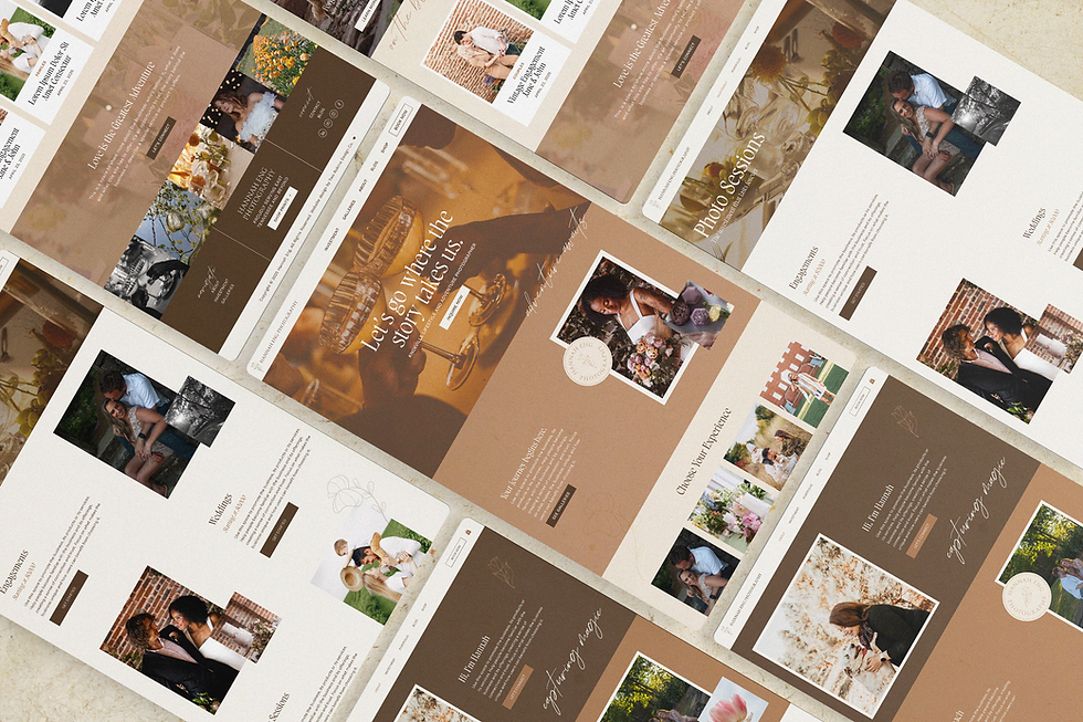
Hannah entrusted us to take the reins on a website project for her growing photography business and come up with something magical. The warm, organic design gave Hannah a digital home that tells her story and leaves a lasting impression on potential clients. Hannah is still perfecting the copy for her website, but you can preview it using the demo link below.


BRAND KEYWORDS
Adventurous, Warm, Natural, Enchanting
The Challenge
Hannah already had a logo for her business, but came to us without a fully-fleshed out branded identity in place. She needed a cohesive visual direction that could be applied to her website — one that emulated her rich, storytelling photography style. Her site needed to feel high-end yet grounded, artistic but not overly polished, and most importantly: like her.

BRAND PATTERN

Our Approach
Using Hannah's existing logo as a foundation, we crafted a broader brand identity that could extend across the full website experience. We pulled font pairings, color inspiration, and layout styles that complemented the logo and her portfolio of photography. “Adventurous” was the word she used to describe her vision and style—so every design choice, from layered textures to immersive page layouts, was guided by that one word.
tap to preview ↓
← hover to preview

BRAND KEYWORDS
À la Carte Services
Rack Card Design
To support The Roosevelt Room’s in-person marketing efforts, we designed a branded rack card for their team to hand out at local promotional events. Compact and eye-catching, it’s a tactile takeaway that leaves a lasting impression on potential clients.

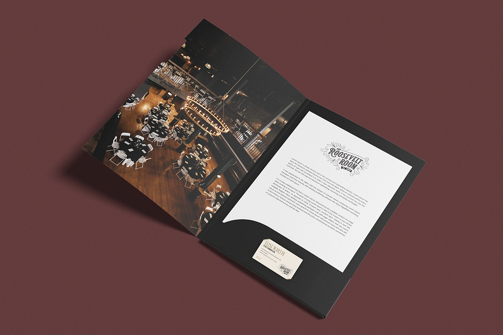
Branded Presentation Folder
To elevate the client experience during venue tours, we designed a branded folder. It’s a small but impactful detail that reinforces the venue’s professionalism and helps prospective clients envision their experience from the very first touchpoint.
THE RESULT
Hannah now has a digital space that reflects the heart of her work. With a strong visual foundation in place, her new site is ready to evolve alongside her business as it continues to grow.
Project Details
NOTES
Some of the collateral shown is conceptual, created to help the client visualize how their brand could come to life across various touchpoints, and may not have been produced in final form.
PHOTOGRAPHY
Photography provided by Hannah Eng ©.
CREDITS
-
service provided
location
Knoxville, Tennessee, USA
Office Hours: M-F 9 A.M. - 5 P.M. ET
connect
© two robins design company 2025. ALL RIGHTS RESERVED.